How do you keep high-value players in the face of competition?
First test of the new desktop app with real players, used to competing platforms, before opening it to a wider audience.
- The stakes
- A new desktop app facing players used to mature competitors.
- What I found
- 5 players out of 5 held back by game speed, and multi-tabling unmanageable.
- The decision
- 4 product priorities set before v2.
- The impact
- Decision time and multi-tabling move to P1 for v2.
Why this study was urgent.
Betclic was launching a new desktop poker app. High-stakes regulars are the players who matter most, and the ones who compare most: they know competing platforms inside out. Losing them on first contact would have cost far more than delaying the wider release.
- Sponsor
- Poker product team
- My role
- Protocol, recruitment, sessions, analysis, readout
- Deliverables
- Prioritised recommendations, video clips, verbatims
Find out whether the experience gives high-value players a reason to stay, before pushing the app to a wider audience.
- RecruitmentParis area
Cash game, Twister and MTT. A mix of Betclic and non-Betclic players.
- 5 moderated sessionsLookback
Desktop app 1.0.4, screen and camera recording, tags added live.
- AnalysisClustering
Verbatims grouped by theme, insights prioritised by frequency and impact.
- ReadoutProduct team
Actionable recommendations, video extracts, priorities before v2.
Why this approach
- Moderated sessions, real games
I needed to see players play, across several tables, and react live. An unmoderated test would have shown neither the timer pressure nor the wrong-table errors.
- 5 players, one consistent profile
On a precise profile (high-stakes regulars), 5 sessions are enough to surface most major usability problems.
- A mix of Betclic and non-Betclic players
Cash game, Twister and MTT, customers and non-customers: to hear from those who play elsewhere and need a reason to stay.
What we needed to know.
- Is navigation intuitive for a regular player?
- Does the app meet the expectations of a modern poker app?
- Where are the areas of confusion?
- Which moments engage players, and which make them drop off mid-game?
What users told us.
- 5/5Speed gets in the way of playing smart
Decision time is felt to be too short to analyse, watch other players or build a strategy. The effect is amplified when multi-tabling.
It goes really, really, really fast, that's true.
Steve · Cash gameI feel like I'm not in control of everything I have to do.
Louis · Twister
- HVUMulti-tabling is unmanageable
You can't see several tables at once: you have to switch windows, which breaks the flow and causes mistakes (accidental sit-out, wrong table).
I click on a game, it's my turn, I go to the other one, and it's already my turn there too.
Romain · Twister · on multi-tabling
Test session, screen only: as soon as several tables are open, windows overlap and the player has to move them by hand. - 4×Tournament info can't be found in-game
Players left, levels, prize structure: you have to leave the table to see them. Seen as a step back compared to competitors. The « + » button to add a table is only discovered by exploring.
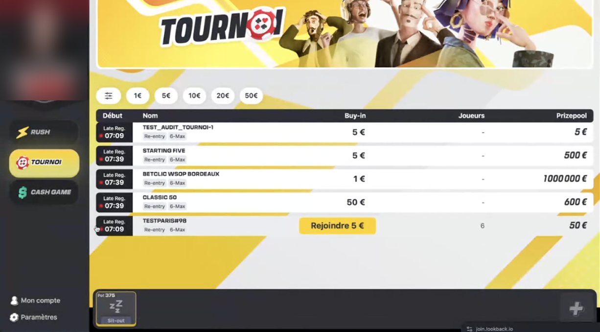
Tournament lobby, desktop app 1.0.4. Players left, levels and prize structure are only visible here, not at the table. - BalanceWatching your balance drop hurts concentration
A spontaneous suggestion: being able to hide your balance during the game. Seeing it go down distracts from the strategy.
As a player, I think it's the worst thing you can find in a poker app.
Dan · MTT
- 5/5Visual design is a real differentiator
Avatars, colours, a « video game » feel: the app seems lighter and less stressful than classic platforms.
It really feels more like a video game... you don't even feel like you're playing for money.
Steve · Cash gameThe avatars are nice... it's a change, it's different.
Romain · TwisterWe don't stand out from all the other apps... it needs a bit of madness.
Dilan · Twister · on the desktop version
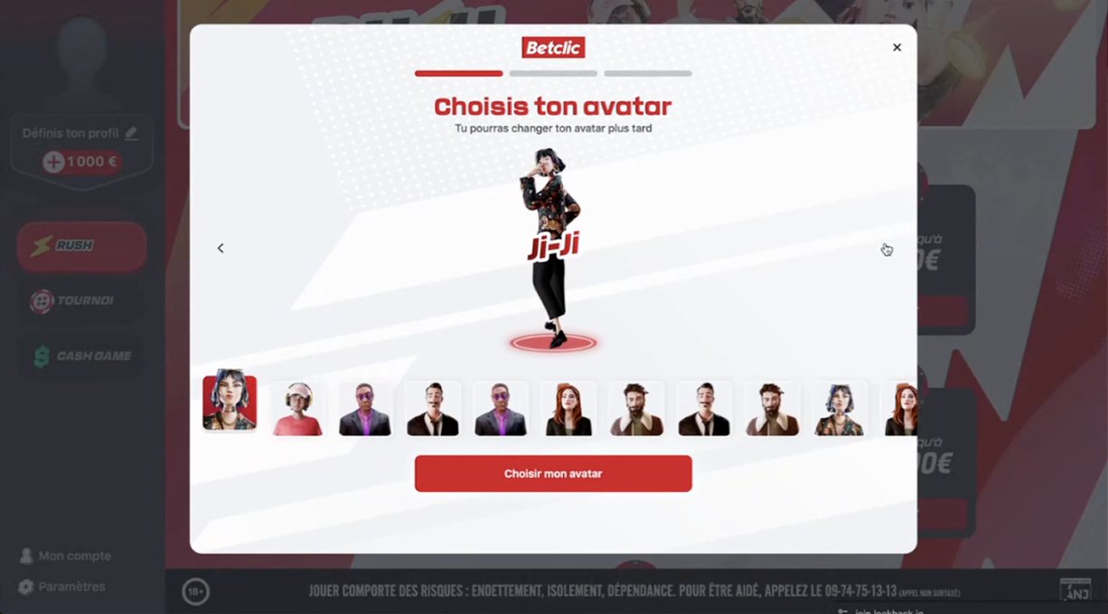
Avatar selection at onboarding: the « video game » feel that 5 players out of 5 singled out.
What to do, in order.
- P1Longer default decision time
And make the remaining timer visible on each table, with a setting per player profile.
- P1A tiled view of tables
Automatic layout on opening and launching several tables in one click.
- P2A tournament info panel without leaving the table
Players left, next level, prize structure in real time.
- P2An always-visible « + » button
With a keyboard shortcut to add a table without going back to the lobby.
4 product priorities agreed before v2 of the desktop app.
4 product priorities set before v2: decision time, a tiled table view, tournament info in game, an always-visible add-table button. The visual design, praised by all 5 players, stands out as the differentiator to protect.
What this study does not tell.
Every method has blind spots. Here are this study's, and how I accounted for them.
- 5 players, in the Paris region, on desktop only.
Frequencies are signals, not proportions. Prioritisation combines frequency and impact on the game, without extrapolating to percentages.
- Being observed changes how people play.
Live tagging and analysis of the recordings make it possible to rely on what players do, not only on what they say.
He very quickly understood our challenges and constraints, and delivered a user journey that exceeded our expectations. The new solution is now in production and is a real success with users and our business teams.
Understand your users.
Improve what matters.
GuidesHow to find out why your users churnHow many users do you need for a user test?Quant or qual? How to combine surveys and interviews
Cédric de la Chaise · Senior User Researcher · 8 years · Betclic, Roland-Garros · X ↗